Cape Eleuthera Resort & Marina
Branding Design
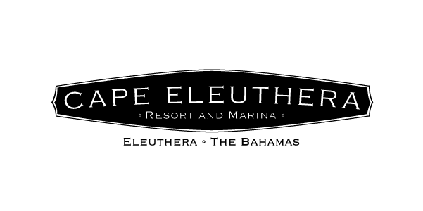
As an on-going client, Grace assists with creation and design updates to printed materials used in the resort. Additionally, she updated the long-standing logo to a more modern and user-friendly design.
The Previous Logo.
Though Cape Eleuthera Resort owners did not want to stray far from the existing branding known throughout the Bahamas, subtle changes and alternate versions were needed for the logo.
Though the coordinates and ornate elements on this logo are fun and charming, they get lost in most applications of the logo. See below for some solutions Grace offered to the team:
-
Removal of Embellishments
To demonstrate minimal changes, the ornate embellishments on the sides were removed.

-
Removal of Coordinates
The coordinates were removed to simplify the area around the business name for emphasis and clarity.

-
Separation of Secondary Text
After removing the coordinates, the Resort and Marina text fit well within the enclosed portion of the logo.

-

-

-

-

-

-

Stacked Version.
Over the years, Cape Eleuthera has noticed the difficulty of using not only a delicate logo with thin lines, but also one that is long. Grace developed options that stack the text and would therefore fill the vertical space more when placing the logo in a square or fat rectangle container.


